Data Visualization
Posted on March 22, 2021
How Can You Better Collect and Organize Data to Support Visualization?
- Collect data at the lowest level of granularity as possible
- Determine how data elements are collected and are related to each other
- Understand who and how institutional data is currently governed
- Map changes to data elements, collection methods, and governance across relevant time periods
- Identify opportunities to “close” open text elements
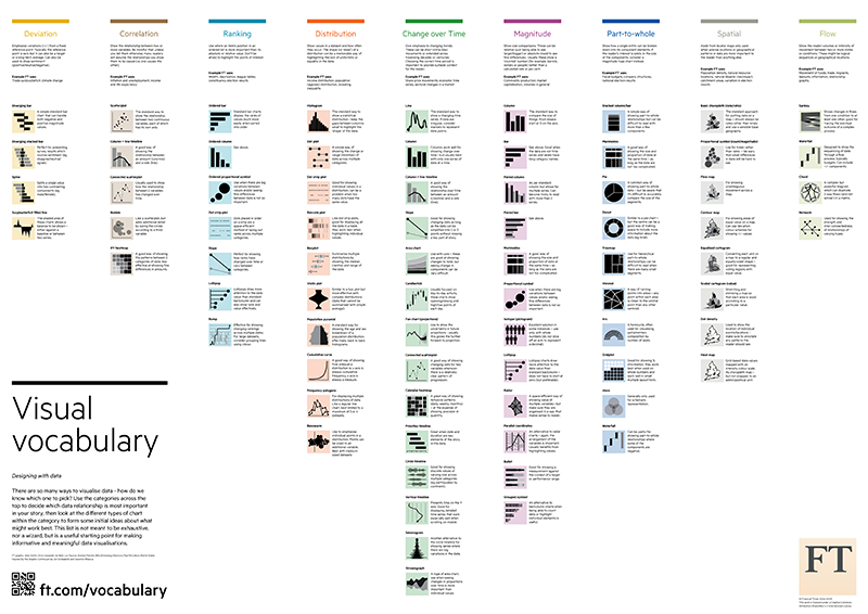
What Visual Is Most Appropriate for Your Data?
Understanding how your data is structured can eliminate certain design options.
Interactive version @ https://ft-interactive.github.io/visual-vocabulary/
How Can You Develop Visualizations That Respect Visual Perception of Information?
Design Objectives
- Accurate representation
- Facilitates accurate and quick understanding
- Memorable
- Appropriate amount of data/context
- Orientation
- Shape/Symbols
- Line length
- Line width
- Size
- Hue
- Tint – amount of white
- Shade - amount of black
- Colorfulness as compared to gray
- Saturation/Brightness –
amount of gray
- Curvature
- Enclosure
- Spatial position
- Motion
- Texture
Selecting Color Palette
- Color-blind
- Perceptual ordering/categories
- Captures nuances of variations
- Conveys gradients
- Displays uncertainty when relevant
- Works across mediums

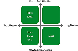
Focusing Intended Users’ Focus
- Understand what your end-users will focus their attention on based on their role, interest, expertise, and familiarity with data and relevant issues.
- Every element you add to the page or screen takes up a cognitive load on the end-user
- Does your design reflect what areas you want the end-user to focus their attention
How Should You Start?
Tools & Platforms
| Beginner | Intermediate | Jedi |
| Excel my.visme.co Infogram.com piktochart.com |
Tableau Power BI Google Data Studio Qlik Domo SAS |
D3.js R Python |
For more information on this topic, read our blog post.
Related Posts:
